TALENT FORGE
- STRATEGY
- VISUAL IDENTITY
- UX DESIGN
- PRODUCT EXPERIENCE
- VIDEO & CONTENT
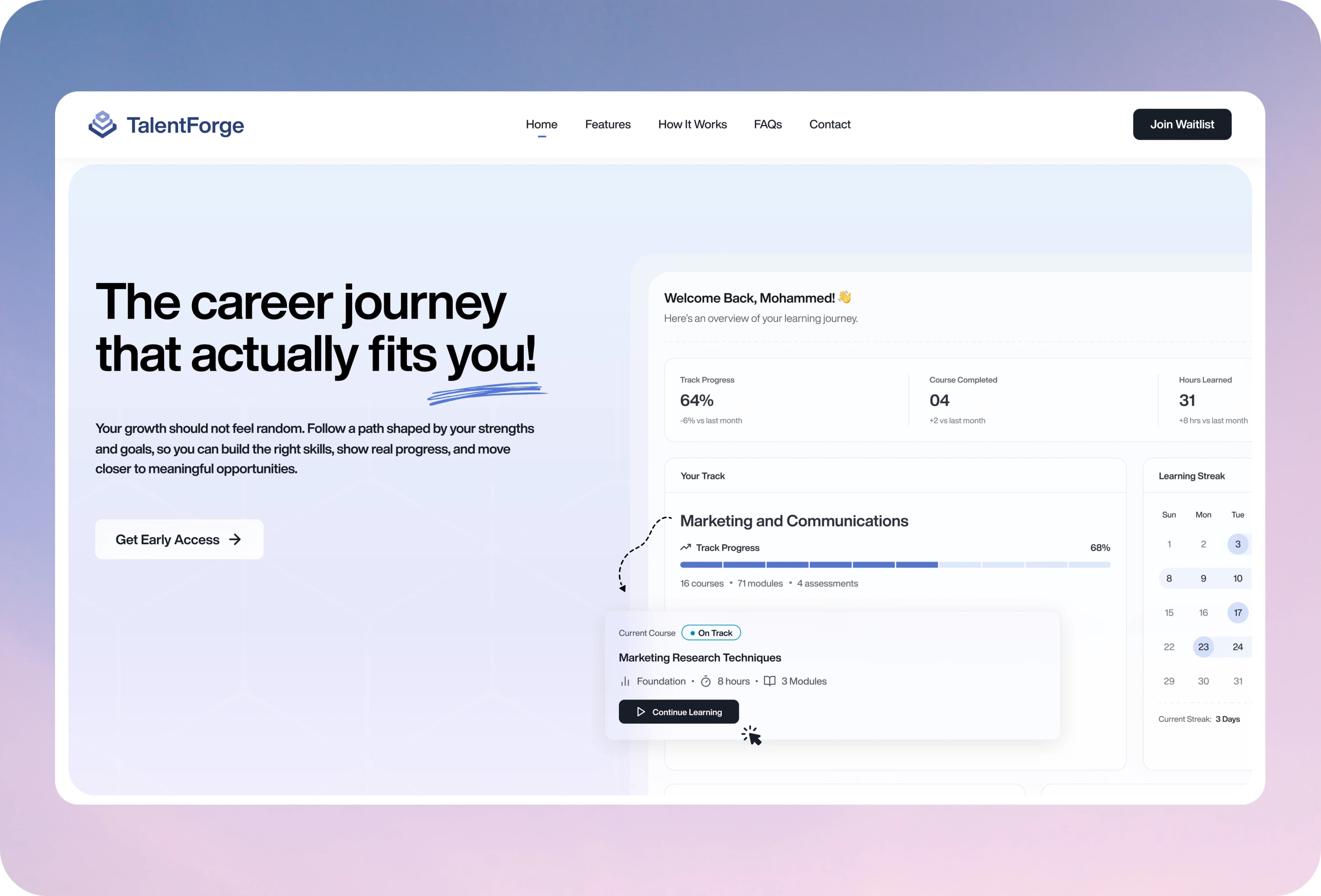
A personalized career platform designed to make hiring, training, and growth feel intuitive, not overwhelming.
Hiring platforms are notorious for complexity: candidates see jargon and broken workflows. Recruiters see chaos. Admins see systems that don't talk to each other. For TalentForge, the challenge was bigger: design a single platform serving three completely different user types (candidates, recruiters, super admins) across Arabic and English, each with their own mental model of what they need.
The ByteCorp Studio Approach
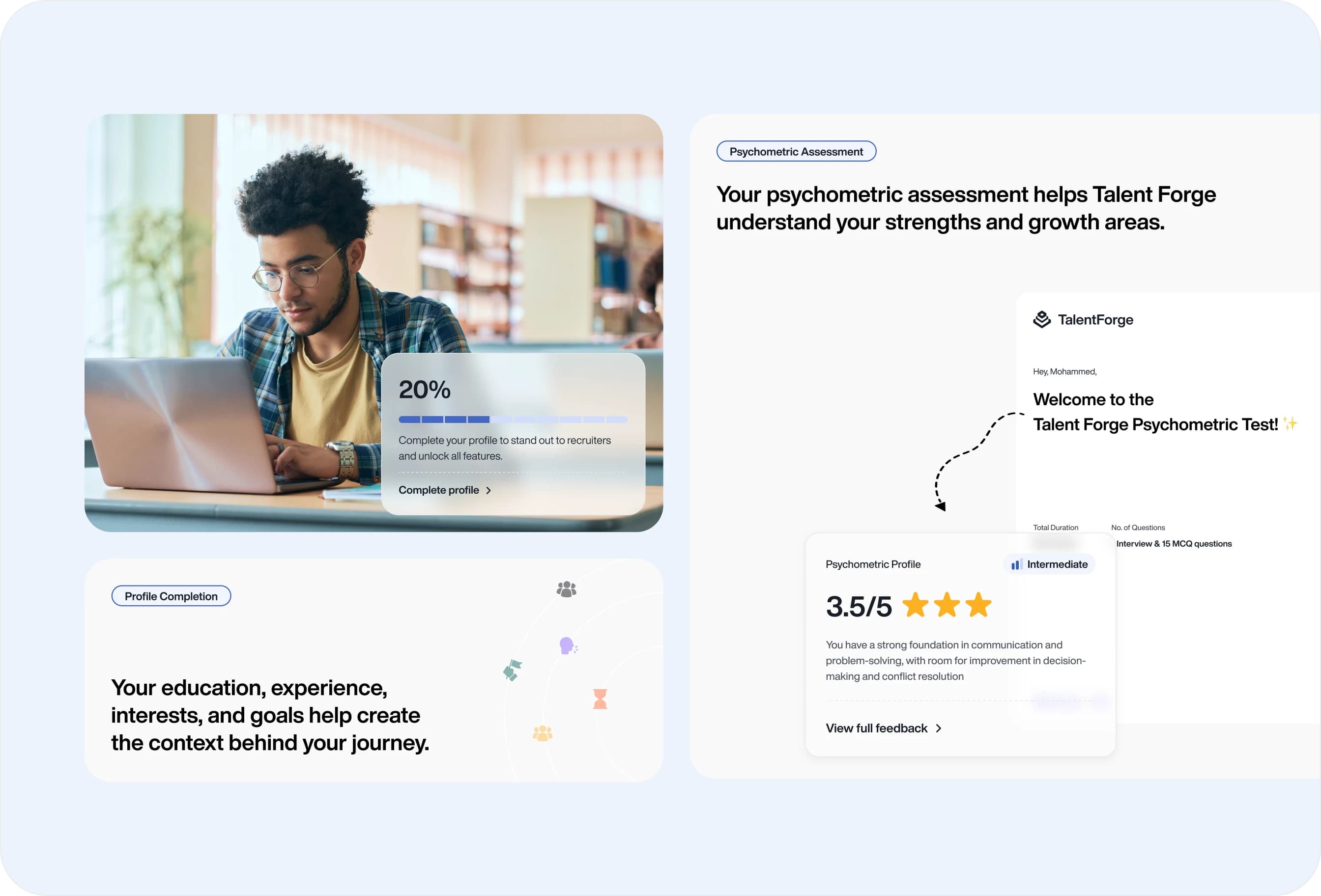
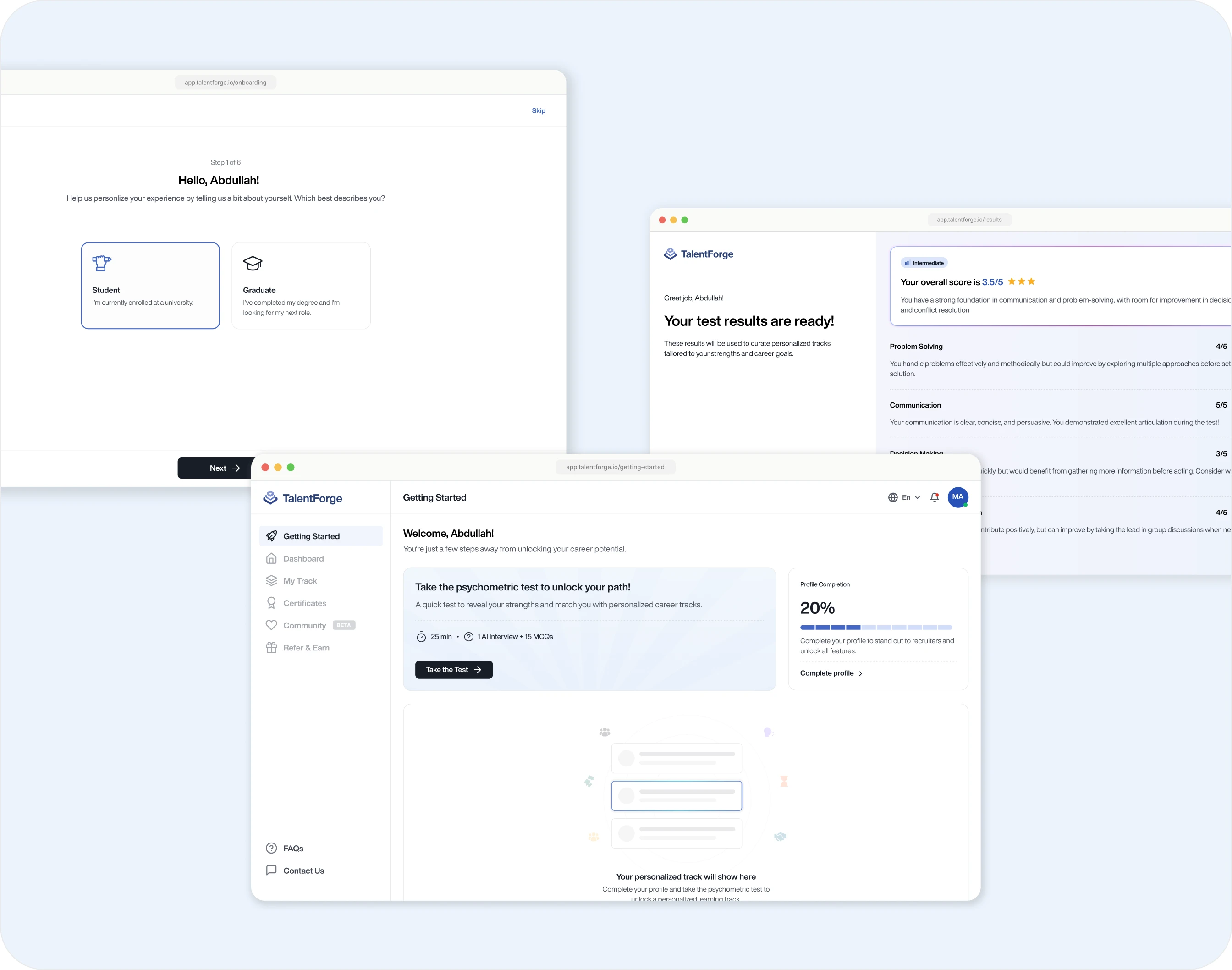
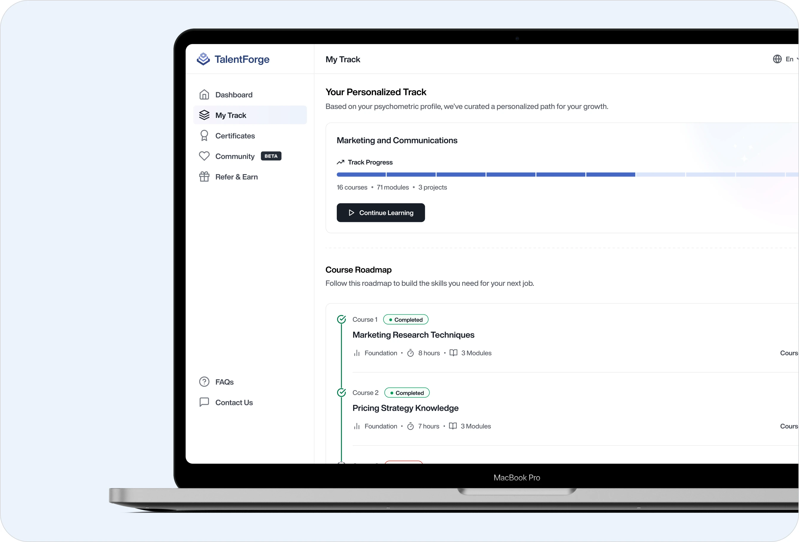
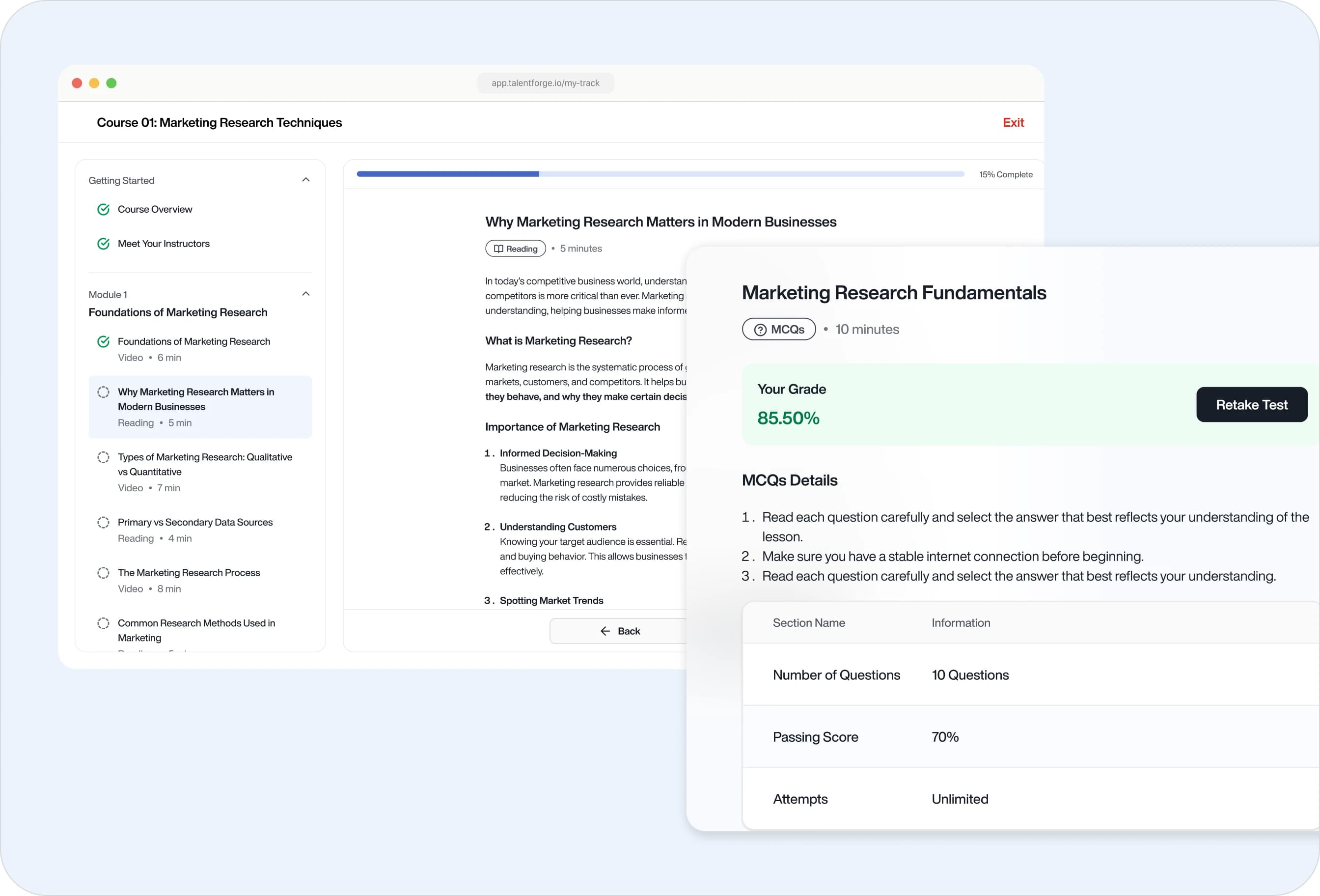
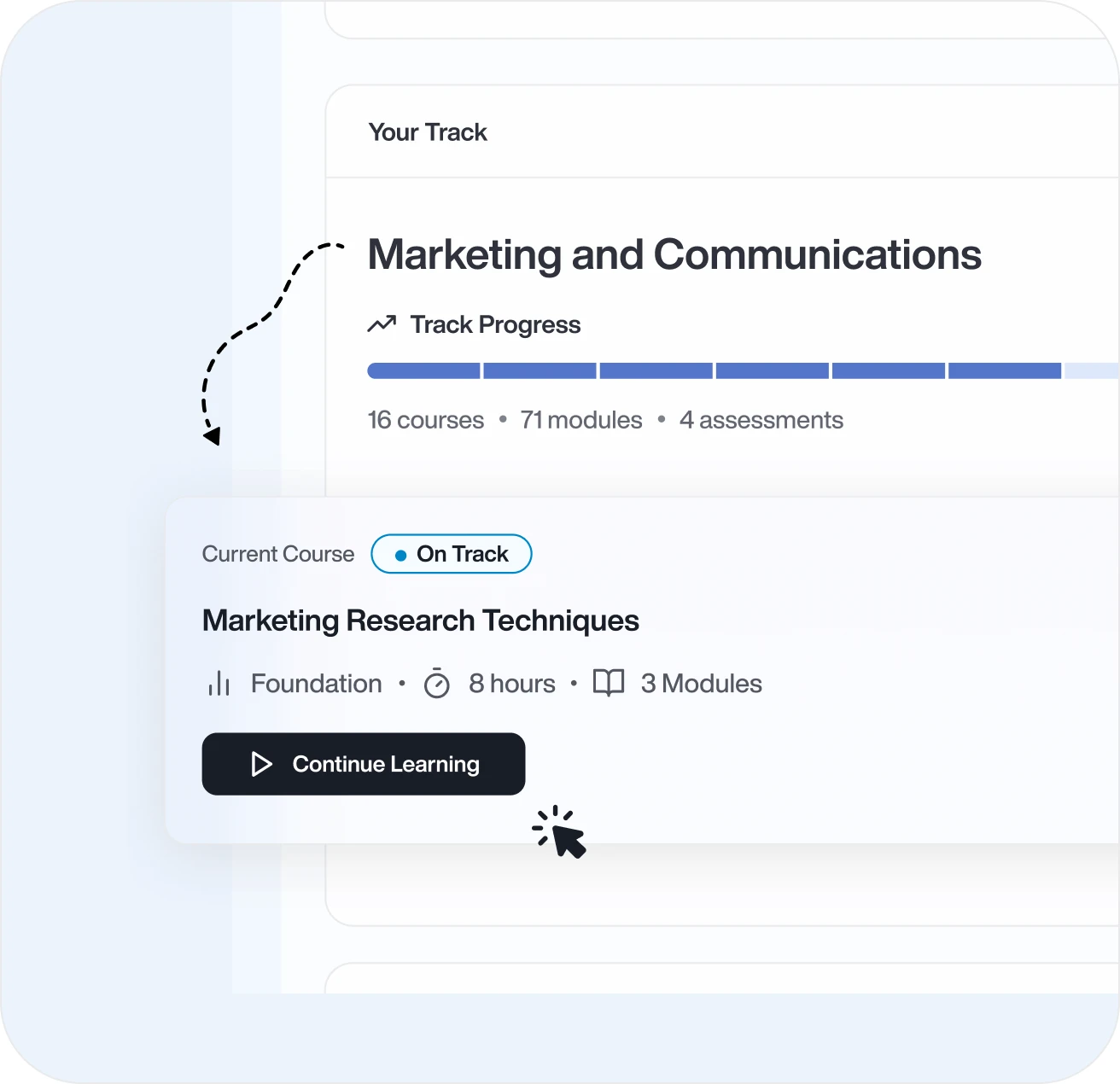
We designed three distinct yet visually unified experiences. For candidates, an onboarding wizard that captures education and goals without friction, then immediately rewards that effort with personalized track recommendations. Document verification, typically a friction point, became a clear status dashboard. Engagement mechanics (progress bars, achievement badges, social sharing, university-based communities) transformed what could be transactional into something candidates want to complete.
For recruiters and admins, we designed separate dashboards that surface exactly what each role needs, candidate performance, approval queues, KPIs, without information noise. The visual language, color system, and interaction patterns stay consistent across all three portals, even as interface hierarchy changes based on role. Arabic and English layouts maintain equal usability and visual polish, designed for Saudi users, not adapted for them.
The Impact
Three Personas, One Brand
Each user type sees what they need, but the design system is so consistent they feel like they're using the same platform.
Reduced Cognitive Load
Clear information architecture meant candidates could complete complex onboarding without confusion.
Bilingual Done Right
Not just translated, designed. Both languages feel native, not like an afterthought.
TalentForge evolved from a complex hiring system into a personalized career platform that feels effortless for candidates, clear for recruiters, and powerful for admins. By designing for psychology, not just process, ByteCorp Studio turned recruitment from something candidates endure into something they actually value.