NXTSTIM
- STRATEGY
- EXPERIENCE DESIGN
- VIDEO & CONTENT
- BRAND EXPERIENCE
A trusted healthcare brand built on visual clarity across every user touchpoint.
NXTSTIM’s ecosystem was functional, but visually inconsistent. Patients, clinicians, and billing teams moved through three different-looking experiences, each with its own colors, button styles, and interaction patterns. Instead of feeling like one connected healthcare product, the platform felt divided across multiple tools. In healthcare, where trust depends on clarity, that inconsistency made the experience feel less reliable.
The ByteCorp Studio Intervention
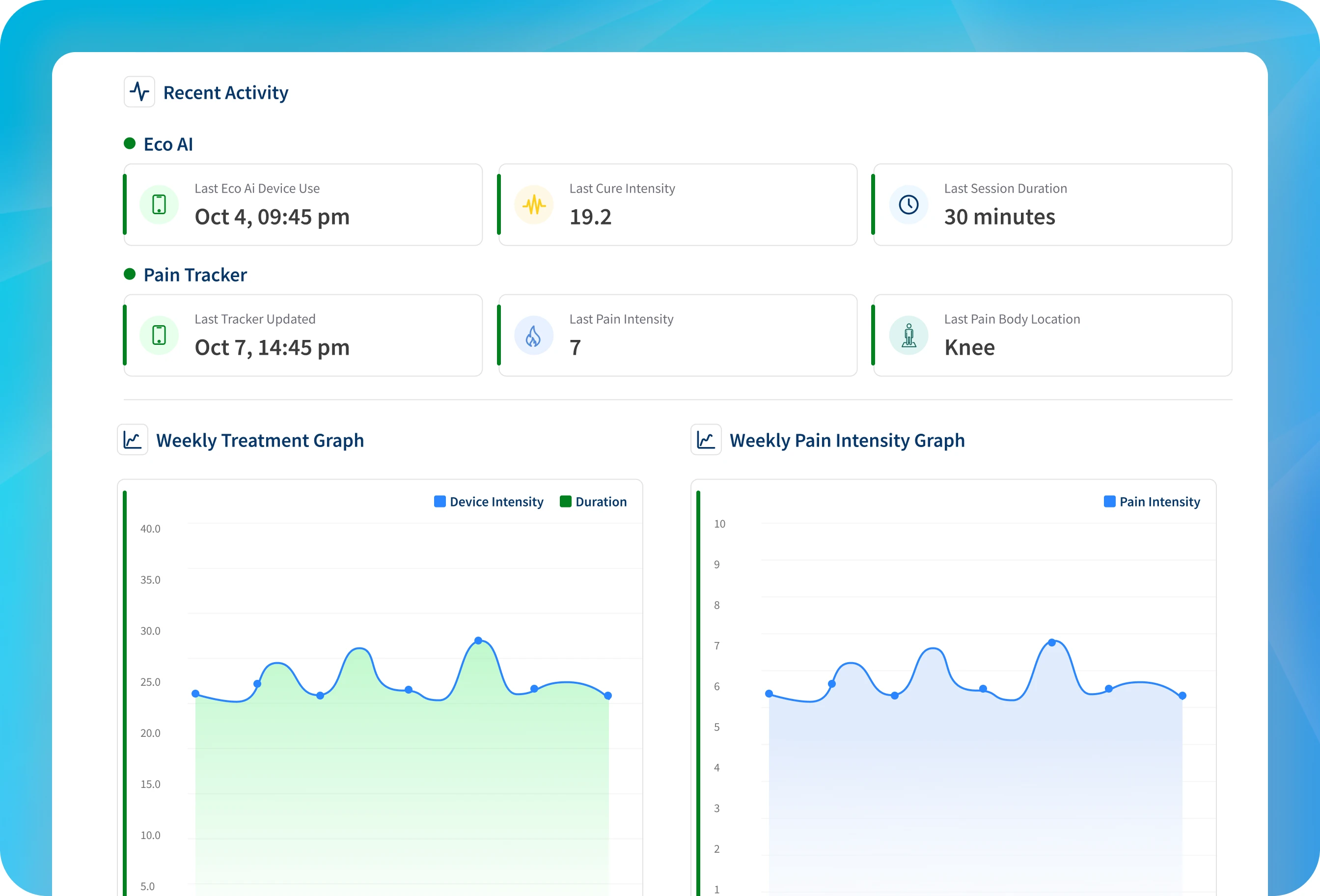
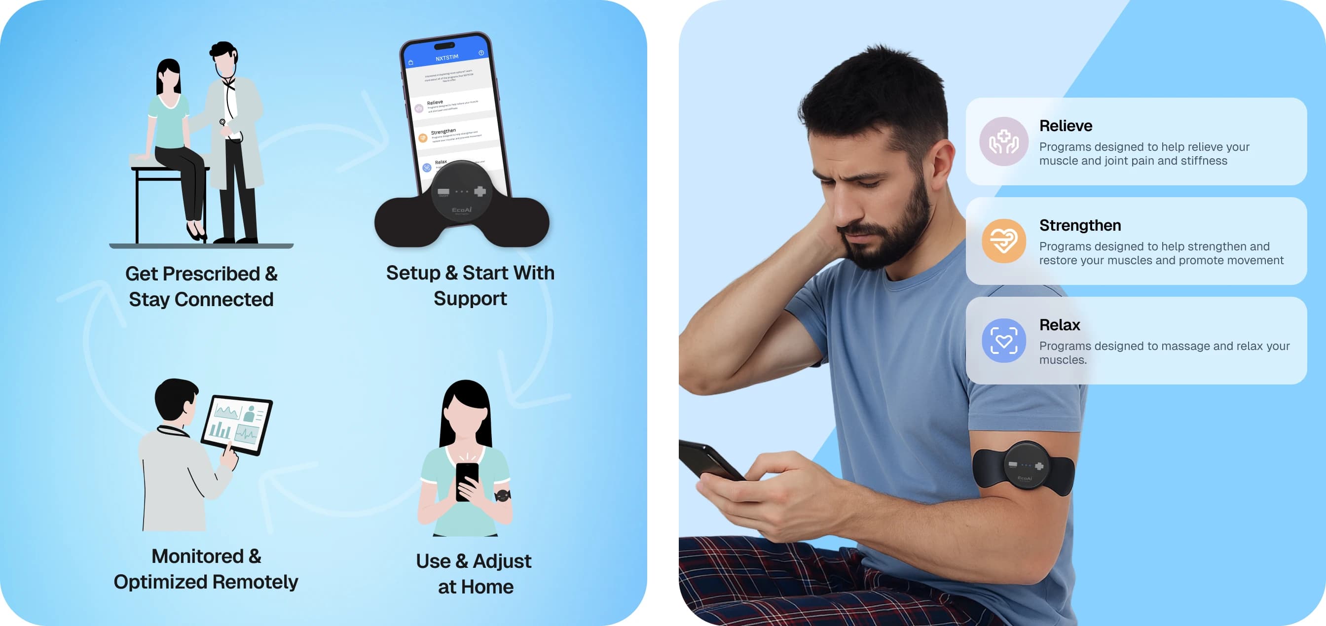
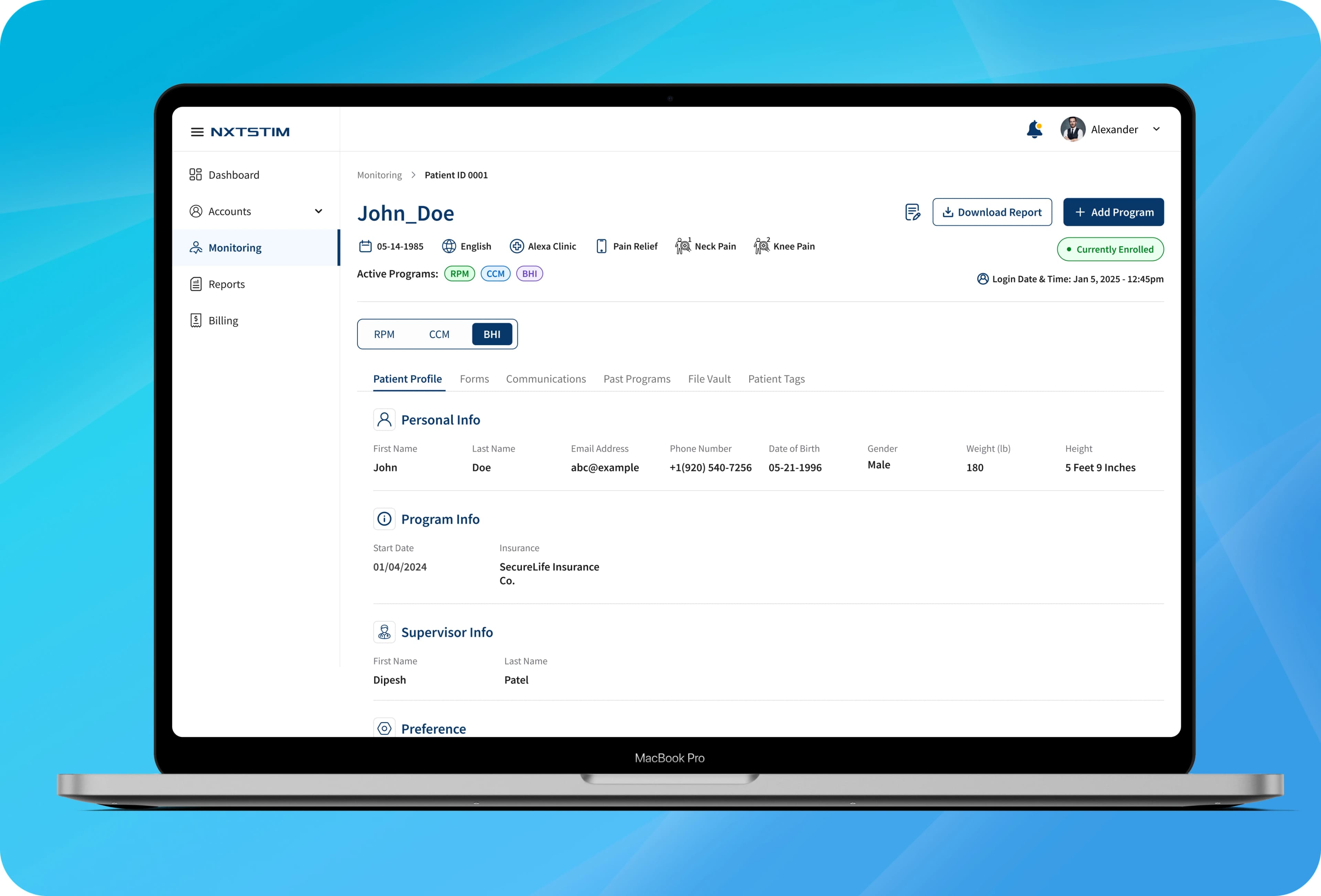
We unified NXTSTIM’s visual identity across the patient app, clinician dashboard, and billing portal. Through Brand Identity, Design System, and UX Design, we created one consistent product language that could adapt across three different contexts without losing cohesion. We redesigned clinical screens around visual hierarchy, simplified patient flows around clear next steps, and brought greater clarity to insurance-code tracking.
The Impact
One Brand, Three Contexts
A unified design system across the patient app, clinician dashboard, and billing portal helped NXTSTIM feel recognizable, consistent, and trustworthy across every user type.
Visual Hierarchy That Guides
Clear use of color, size, placement, and emphasis helped users understand what was urgent, important, or secondary, reducing cognitive load and decision fatigue.
Clarity as Competitive Advantage
NXTSTIM’s restrained, intentional design made complex healthcare information feel manageable, turning clarity into a brand advantage.
$200,000+ ARR Recovered
A clearer, automated experience around RPM and CCM insurance codes helped recover six figures in previously lost revenue, a number that continues to grow.
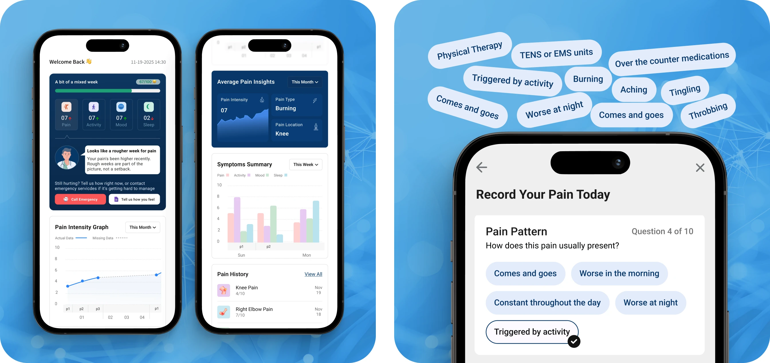
NXTSTIM evolved from a set of disconnected tools into one cohesive healthcare brand. By bringing clarity, structure, and consistency across the ecosystem, ByteCorp Studio made every portal feel more dependable and confident.